Poor Sleep Quality vs Stress Score and Alcohol Use
The ggside package allows users to add supplementary side plots to a plot within a main panel. Ggside provides an efficient way to compare variables while maintaining legible visualizations. On top of this, the graphs look really pretty!
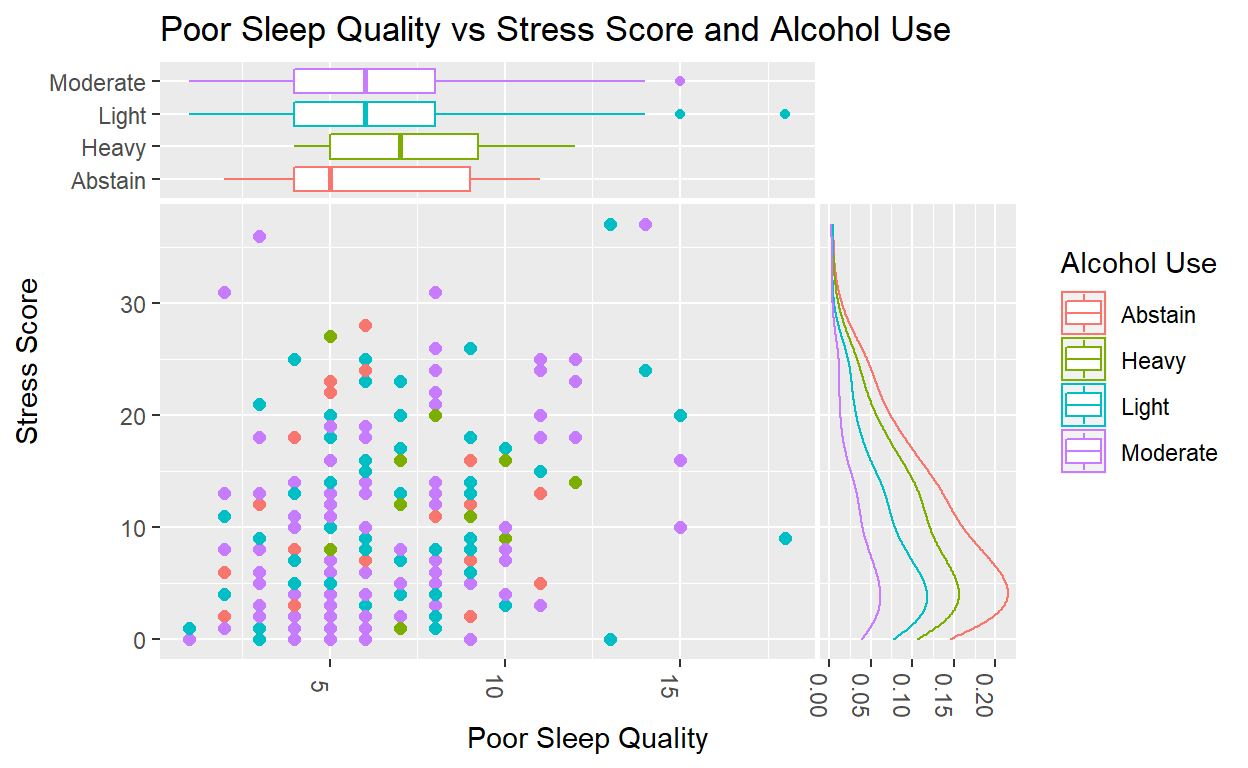
Nick, Grace, and I chose a data set called “SleepStudy” that collected both categorical and quantitative data from the sleep patterns of college students. For this graph specifically, we chose to evaluate the relationship between poor sleep quality and stress score in which a high value indicates worse sleep and higher stress, respectively. Through ggside’s features, we were also able to consider a third variable, alcohol use, in relation to the other two. Alcohol use is a self-reported measure of how much one consumes alcohol, broken into four categories: abstain, light, moderate, heavy (i.e. abstain indicating no alcohol consumption and heavy indicating high alcohol consumption).
Thus, in the case of our ggside plot, we utilized a scatterplot in the main panel to see if there was any correlation between sleep quality and stress, and we also colored each point according to alcohol use. Using ggside, we placed a box plot along the top of the scatterplot, allowing us to compare the relationship between sleep quality and alcohol use through elements of a box plot, such as median, IQR, etc. Along the right side of the graph, we inserted a density plot to evaluate the relationship between stress score and alcohol use.
