Confidence Interval Error Bar Chart
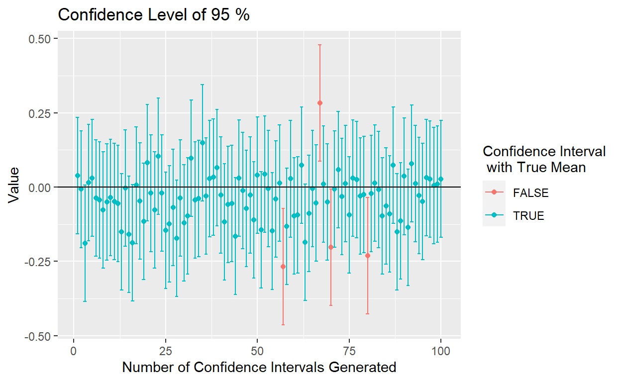
Peter, Danny, and I collaborated on a project that was geared toward helping introductory statistics students understand confidence intervals. After lots of random sampling, we created an error bar plot to demonstrate how a confidence level worked and how it potentially affects the proportion of confidence intervals that capture the true parameter. For our graph, blue bars corresponds to confidence intervals that do capture the true parameter, whereas red bars represent confidence intervals that do not capture the true parameter.

SAT Score Heat Map
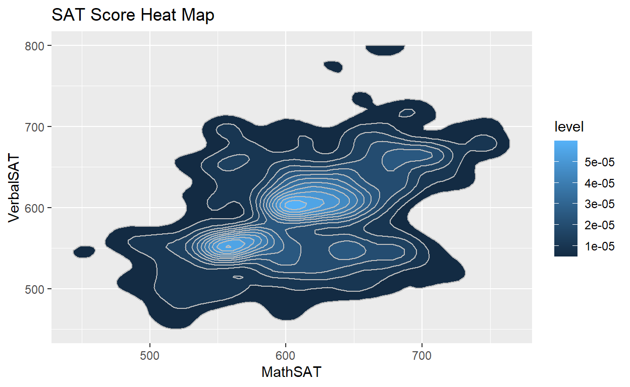
StudentSurvey is a dataset that contains information from a survey given to introductory statistics students over the course of several years. In this heat map, we will consider two of StudentSurvey’s variables: Verbal SAT score and Math SAT Score. Heat maps utilize shading to denote different densities of a phenomenon. In this example, a lighter shade of blue represents where more of a phenomenon occurred, which can be seen within the inside of the plot, whereas a darker shade of blue represents where less of a phenomenon occurred, which is present more along the outside of the plot.
